Working on Dean’s Face

Here I am finally back with an update. Being on third shift at work is kicking my butt. I hate working nights, but things are slow at the satellite factory and I knew better than to refuse this assignment. I could have been one of the casualties in the recent layoffs.  For all it’s sophisticated technology, testing a satellite can be boring, so I do find I have long stretches of time to plan and think about my favorite things, like what’s next on my current art project.

I’ve been thinking about Dean’s face and when I get a chance, I do a little work on it.  And I do mean little, if I’m not at work, I’m sleeping or trying to wake up enough to do something useful.  But anyway, now that I have whined enough, here are the progress pics.

DeansFace1

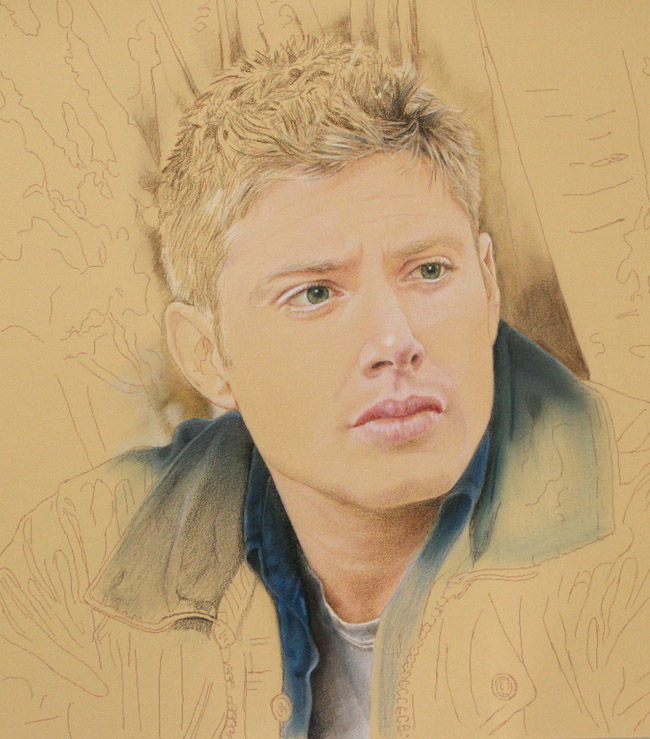
At this stage I have put a few layers of skin tone colors in the his cheek areas. I have layered different shades of peach, pink, and white in the lighter areas and have started defining the shadows on his chin a lot more. I have started blocking out the subtle transitions between highlight and shadow on his cheekbone, the creases around and under his mouth. At this point I have mostly concentrated on the right side of his face, which makes the yellow undertones in other areas, especially in his forehead,  stand out more in contrast.

DeansFace2

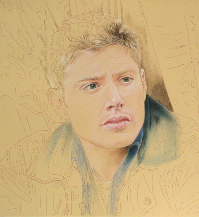
Here it is another couple of  hours of work later. The color is looking much more polished now because of all the layers applied and the highlights sitting on top. There is much more coverage of the paper, though his forehead still needs work. I’ve softened the color on his lips and smoothed the colors on his chin for a more rounded look. In a way, I’m still experimenting, adding shadows, then softening them it they look out of place and then maybe darkening again. The underlying colors are not totally obscured, they seem to all blend together and seem more lustrous, even as they lighten or darken.

DeansFace3

It’s harder to tell what has changed here, mostly his skin is looking even more polished. I’ve sharpened his eyes, eyelashes and his left brow, fooled around with the highlights in his eyes. I think one of the most important changes from the last pic is that you can see how I changed the contour between light and shadow on the left side cheekbone. In the previous picture the shadow was a bit too high and moved in toward his nose too much. It gave him kind of a apple cheek look. His cheekbone is actually kind of broad and the highlight  spans from under his eye almost to the side of his face and down a bit. It still isn’t perfect.

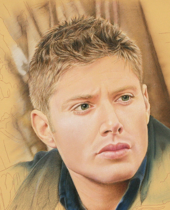
I have to decide how much darker I’m going to take his five o’clock shadow. I have barely hinted at it here. The problem is that I’m not sure exactly how to put in a whiskery chin. It’s a great temptation to leave his face looking this flawless, but it wouldn’t really be him.  I’m torn.

I still have to work on his forehead. I haven’t added half as many layers there yet and you can tell. I also have to darken and define his right brow some more. Unfortunately in the reference picture he has a big bruise situated right on this brow and it makes it difficult for me to distinguish what is a normal shadow and what is bruise. I will have to go and look another good resolution picture of him to help me define how this brow should look.

So now, I have some to go back and stare at his face some more, what a chore ;-0

Dean Update

Most of the new work is on his hair and background around his head. I also built up the colors on his ears.

DeanUpdate.jpg

There were a lot of colors and layering involved in getting his hair to this stage. Below is an interim shot when I was still building up the colors. You could still see a lot of the paper and overall his hair color was still too light. I thought about it a while, wondering what to do to get the right look.

DeanUpdate2.jpg

I knew I had to darken his hair color in general so I applied a light layer of medium brown over everything on the top of his head. Then I went in and darkened the shadow areas even more trying to cover the paper more completely. Once the darkest darks were in, I put some of the highlights back in on top of them. I repeated this process a few times, putting down medium and dark colors and them coming back to add highlights as needed.

His hair is a dark blonde, but seems to go quite lighter around his temples and face, and that is what I tried to capture.

My initial idea of defining the highlighted areas and then working the mediums and darks around them didn’t work out too well. Fortunately putting highlights in over the darks works on this paper. Adding highlights as pencil strokes over the dark colors made them look more natural, the pencil lines looking more like hair than when I tried to work around light areas.

Here is a close up of the finished hair.

DeanUpdate3

You can also see here how I defined the edges of his head against the soft background a lot more.The secret is that when the background color shifts to a light color, then the edges of your foreground object should shift to dark and vice versa. If you notice the top of his head stands out against the lighter background while the side are light against the dark, with some shifts back and forth in between. Another trick which works in this case is to make the foreground object edges as crisp as possible against the diffused backdrop.

Since I worked on his right ear, you can really tell that the color is pinkier than his cheek area, in other words more what like his finished skin tone should be. The good thing is that now I can get back to work on his face and make that happen!

4th of July Update II

These last update posts got clumped together because my laptop was infected with a nasty virus a few days ago. It took my poor hubby days to eradicate the sucker. Actually he had to reload the operating system! Fortunately I didn’t lose any of my files.  But anyway, my last update post is really my status from a few days ago and this one is where I’m at right now. I have another day of my 4th of July holiday left, so hopefully I’ll be able to move it along some more before real life claims me again.

DeanJuly4_2

Okay, this is a more substantial update. I worked quite a bit on his neck.  I put some contouring shadows and highlights in and some more color. In fact, his neck now looks more peachy pink than his cheeks, but that will change when I start working on his face again.

I’m pleased how the blues of his shirt have deepened. That bristle brush stroking of the colored pencil really makes a difference. I tried to differentiate the colors of his jacket and shirt here more too. I’m trying to make the jacket more of a grey color now.

For his T-shirt I deviated a little from the reference photo, leaving out some of the deep wrinkles  for a smoother look.

On his hair I added dark and midtone color all over  to define this area a little more. I experimented a bit on the left background to see how a fuzzy color would look against the more crisp line of his jacket. I think this will work out okay

4th of July Update I

DeanJuly4

It’s just a little update.

I darkened the blues for his jacket and shirt.. I’m definitely using the bristle brush here to spread the colored pencil down into all the nooks and crannies of the paper. The blues are similar to each other in the reference picture but  I think I will have to differentiate them more in this portrait. I also put a little more color in the background to see how the brown of the tree looks next to the blues.

I darkened the shadow under his chin a little too.

Dean Continued

I’ve done a little bit more. Having to return to work last week has seriously impacted my ability to indulge in my real interests, like reading Sam and Dean fanfiction, rewatching my Supernatural DVD’s and working on my Winchester art.

On a more positive note, my husband solved the mystery of why I was having such a hard time getting true color photos of my Dean pic. The white balance setting was off on my camera. I should have figured that out myself and not allowed everyone to think that Dean was really looking that bilious. As long as I’m being truthful here I might as well confess that he also convinced me not to be so lazy and to set up the camera on the tripod properly instead of using my not so steady hands to take the pictures. As a result of all this, today’s  progress pic is much more true to the real color and much sharper.

I worked on his hair some more, trying to define the pencils that will give me the correct colors here. So far what I’ve used are ivory oxide and ginger root for the highlights, sandbar brown and brown ochre for the midtones and raw umber, sepia and expresso for the darks.

I won’t work on his face anymore until I can build up the color around it. I blocked in some of the shadow under his chin and began experimenting with the blues of his shirt and jacket. I’m using the stencil brush here to move the color. I also barely began to put some of the tree color in behind his head. I realized that I really shouldn’t define the edges of his hair until the background was in because the wispy light colors of his hair should be the last layer of color here, overlapping the darker background.

The shadow under his chin and the blues of his clothes will be very dark when I’m done, or at least that’s my goal. I think the background will look best left fuzzy and unfocused, more so than the reference photo. At least that is the plan now, it might change as I progress further.

Here’s a closer look at his hair.